

Overview
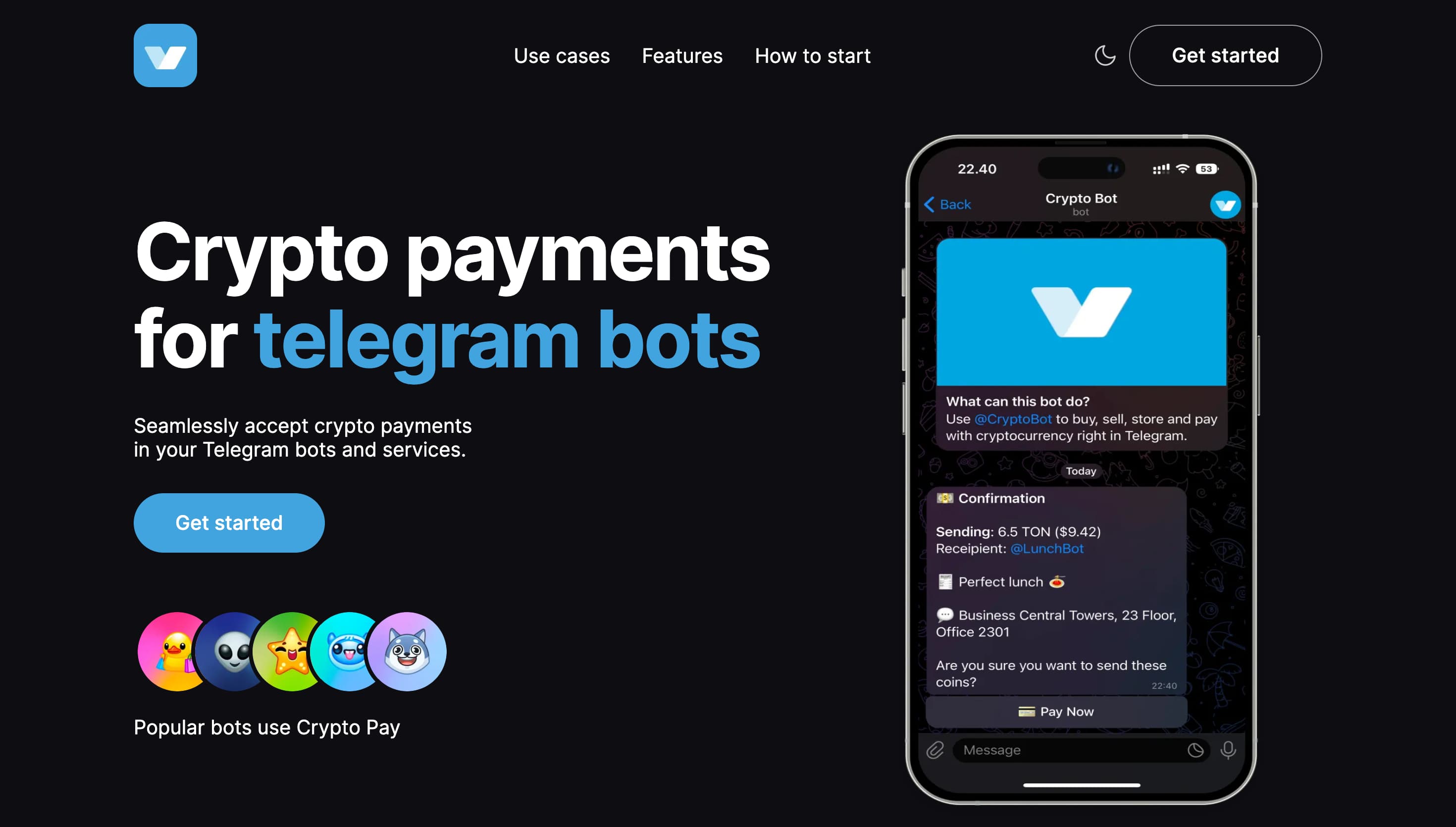
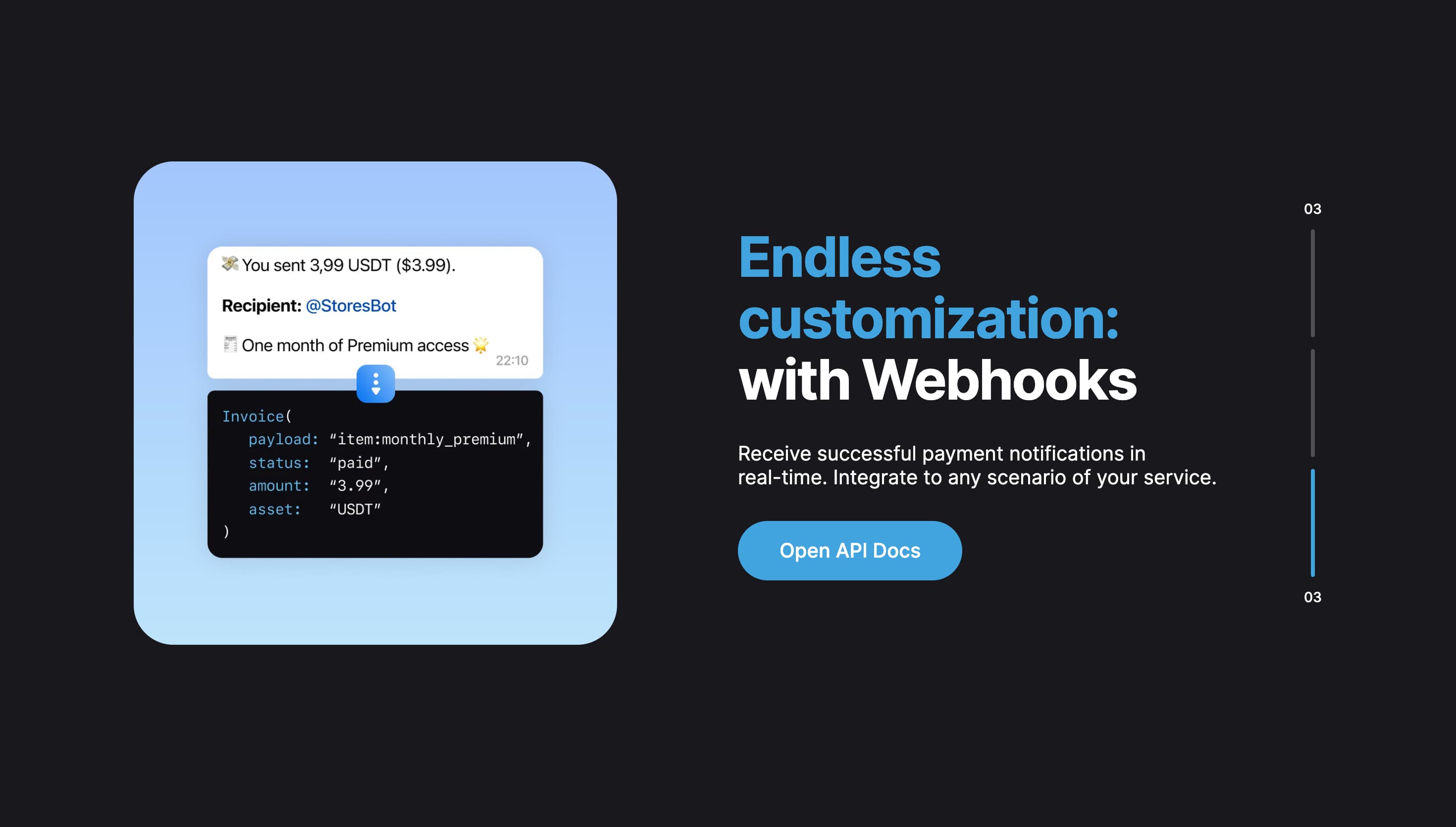
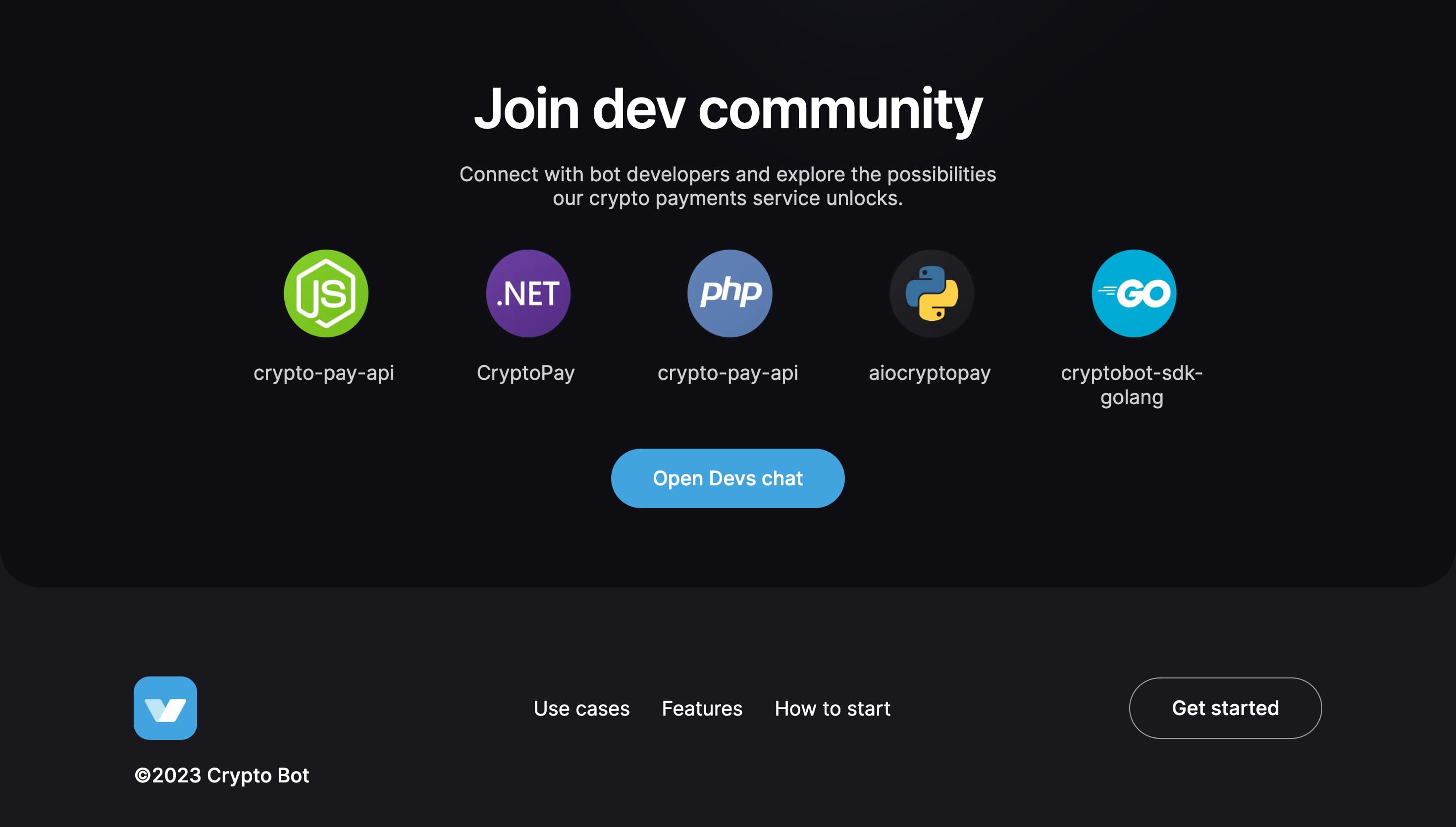
CryptoPay is a one-page landing page created for a web development competition. The task was to reproduce a provided CryptoPay design as closely as possible using HTML, CSS, and JavaScript, with frameworks allowed. I built the project with Next.js and TypeScript and took second place in the contest.
Unlike the product-oriented projects in this portfolio, this one is mostly about implementation precision: translating a dense Figma layout into responsive sections, preserving visual rhythm, building theme-aware assets, and recreating motion details without relying on a heavy animation library.

Page structure
The landing page is assembled from independent page widgets: header, hero, use cases, features, instructions, API block, community block, and footer. That structure keeps a visually complex page from becoming one large component.
export default function Home() {
  return (
    <ThemeProvider>
      <Header />
      <HeroBlock />
      <UsecasesBlock />
      <FeaturesBlock />
      <InstructionBlock />
      <ApiBlock />
      <div className="bottom-bg">
        <CommunityBlock />
        <Footer />
      </div>
    </ThemeProvider>
  );
}
Each large section owns its own layout and CSS Module, while smaller shared pieces such as Container, Logo, Nav, RoundedButton, and GradientBlock are reused across the page.
Theme-aware interface
The design includes light and dark visual states, so the project uses a small context provider to track the active theme, react to system preference changes, and write the current theme into document.body.dataset.theme.
export function ThemeProvider({ children }: { children: ReactNode }) {
  const [theme, setTheme] = useState<string>(
    typeof window !== 'undefined' &&
      window.matchMedia('(prefers-color-scheme: dark)').matches
      ? 'dark'
      : 'light'
  );

  useEffect(() => {
    const mediaQuery = window.matchMedia('(prefers-color-scheme: dark)');
    mediaQuery.addEventListener('change', handleChange);

    return () => {
      mediaQuery.removeEventListener('change', handleChange);
    };
  }, [handleChange]);

  useEffect(() => {
    document.body.dataset.theme = theme;
  }, [theme]);

  return (
    <ThemeProviderContext.Provider value={{ theme, setTheme }}>
      {children}
    </ThemeProviderContext.Provider>
  );
}
Components with theme-specific visuals subscribe to this context and switch their assets accordingly. For example, the hero phone mockup changes between light and dark screenshots.
export function HeroPhone() {
  const [phoneImg, setPhoneImg] = useState(imgPhoneLight);
  const { theme } = useContext(ThemeProviderContext);

  useEffect(() => {
    theme === 'light' ? setPhoneImg(imgPhoneLight) : setPhoneImg(imgPhoneDark);
  }, [theme]);

  return (
    <div className={styles.phone}>
      <Image src={phoneImg} alt="Screen" width={500} height={500} priority />
    </div>
  );
}
This kept theme-specific presentation close to the components that actually render those visuals.
Responsive slider
The use cases section is a custom slider. It changes axis depending on viewport size: desktop slides move vertically, while smaller screens use horizontal movement that feels more natural on touch devices.
const [currentSlide, setCurrentSlide] = useState(0);
const [touchStart, setTouchStart] = useState(0);
const [touchEnd, setTouchEnd] = useState(0);

const isXAxis = useMediaQuery('(max-width: 1175px)');

const handleTouchEnd = () => {
  if (touchStart - touchEnd > 50 && currentSlide < slides.length - 1) {
    setCurrentSlide(currentSlide + 1);
  }

  if (touchStart - touchEnd < -50 && currentSlide > 0) {
    setCurrentSlide(currentSlide - 1);
  }
};
Each slide receives a transform calculated from its index and the active slide:
{
  slides.map((slide, index) => (
    <SliderItem
      key={index}
      {...slide}
      style={{
        transform: `${isXAxis ? 'translateX' : 'translateY'}(${
          (index - currentSlide) * 150
        }%)`
      }}
    />
  ));
}
This gave the section a single interaction model while still matching the design's desktop and mobile layouts.
Viewport-triggered animation
The feature grid uses IntersectionObserver to start animations only after the block enters the viewport. That matters on a long landing page: animation should support the section when the user reaches it, not play too early off-screen.
export const useOnScreen = (ref: RefObject<HTMLElement>): boolean => {
  let observer: any = null;

  const [isIntersecting, setIntersecting] = useState(false);

  if (typeof window !== 'undefined') {
    observer = new IntersectionObserver(([entry]) =>
      setIntersecting(entry.isIntersecting)
    );
  }

  useEffect(() => {
    observer.observe(ref.current as HTMLElement);
    return () => observer.disconnect();
  }, [observer, ref]);

  return isIntersecting;
};
The feature section passes that state into animated cards:
export function FeaturesBlock() {
  const featuresBlockRef = useRef<HTMLDivElement>(null);
  const isInView = useOnScreen(featuresBlockRef);
  const isSmall = useMediaQuery('(max-width: 1110px)');

  return (
    <div ref={featuresBlockRef} className={styles.featuresBlock}>
      <Container>
        <Box style={boxPadding}>
          <Commission isInView={isInView} />
        </Box>
        <Box style={boxPadding}>
          <Verification isInView={isInView} />
        </Box>
      </Container>
    </div>
  );
}
One example is the “Create App” card: when the section is visible, the cursor and button receive animation names that differ for desktop and small screens.
<Cursor
  style={
    isInView
      ? isSmall
        ? { animationName: 'cursorMoveInSm, cursorMoveOutSm' }
        : { animationName: 'cursorMoveIn, cursorMoveOut' }
      : {}
  }
/>
The animation itself is defined in plain CSS keyframes, keeping the project lightweight.
@keyframes cursorMoveIn {
  0% {
    right: 8%;
    bottom: 8%;
  }

  100% {
    right: 16%;
    bottom: 20%;
  }
}

@keyframes buttonClick {
  0% {
    transform: scale(1);
  }

  50% {
    transform: scale(1.1);
    background: var(--click-to-start-btn-active);
  }

  100% {
    transform: scale(1);
  }
}
Responsive text and assets
Some copy in the design needs different line breaks on different screen widths. Instead of duplicating text blocks, the project stores line-break hints with | and adapts them at render time.
export const adaptString = (
  string: string,
  variant: 'withBr' | 'withoutBr'
): React.ReactNode => {
  if (variant === 'withBr') {
    const parts = string.split('|');
    return parts.reduce(
      (acc: React.ReactNode[], part: string, index: number) => {
        if (index === 0) {
          return [part];
        }
        return [...acc, <br key={index} />, part];
      },
      []
    );
  }

  if (variant === 'withoutBr') {
    return string.replace('| ', '');
  }
};
The same concern appears in section visuals. Shared blocks accept dimensions and responsive style overrides, which made it easier to reproduce Figma proportions across desktop and mobile.
export function GradientBlock({
  image,
  gradient,
  width,
  height,
  style
}: {
  image: StaticImageData;
  gradient: string;
  width: number;
  height: number;
  style: CSSProperties;
}) {
  return (
    <div
      className={`${styles.gradientBlock} bg-gradient-${gradient}`}
      style={style}
    >
      <Image src={image} alt="" width={width} height={height} priority />
    </div>
  );
}
Outcome
CryptoPay became a strong layout and interaction exercise: it required design accuracy, responsive reasoning, asset management, theme support, custom slider logic, and coordinated CSS animations. The result secured second place in the competition and remains one of the clearest examples in my portfolio of turning a static design into a polished landing page.
The code also shows a useful engineering habit: even for a one-page contest entry, the implementation was split into widgets, shared UI, hooks, utilities, and scoped CSS Modules instead of being kept as a single monolithic page.